Core UX Principles
Accessibility:
Ensuring that designs can be used by everyone, regardless of their abilities or disabilities. This includes creating features for people with visual, auditory, motor, or cognitive impairments. Examples include screen reader compatibility, captions for videos, and color contrast ratios that work for colorblind users.

Affordance: The visual or physical clues in a design that hint at how an object should be used. For instance, buttons that look raised signal they are clickable, and handles on doors suggest pulling. Good affordance reduces guesswork for users and makes interactions more intuitive.
User-Centered Design (UCD): A design philosophy that focuses on solving real user problems by prioritizing their needs, goals, and feedback throughout the design process. This method ensures that products are not only functional but also user-friendly, improving satisfaction and efficiency.
Feedback: Immediate and clear responses given to users after an action, letting them know whether it was successful or not. For example, a progress bar during a file upload reassures users that the system is working, while an error message provides clarity when something goes wrong.
Consistency: Maintaining uniformity in design elements like colors, fonts, icons, and layouts across a product to create a cohesive experience. Consistency helps users predict behavior, reduces the learning curve, and builds trust in the interface.
Empathy: The ability to step into a user’s shoes to understand their emotions, frustrations, and motivations. Empathy drives better design decisions by ensuring that the product meets users’ real needs and solves their problems effectively.
Simplicity: Creating clean, straightforward designs that eliminate unnecessary complexity. Simplicity doesn’t mean removing functionality—it’s about presenting only what’s essential, making tasks easy and efficient for users.
Learnability: How quickly a user can understand and start using a product effectively. Products with high learnability often use familiar patterns or cues from similar tools, ensuring users don’t feel lost or frustrated when navigating.
Discoverability: Making features and functionalities easy to find so users can explore without frustration. Good discoverability ensures that important actions—like finding a contact form or using filters—don’t require excessive effort or hunting.
Error Prevention: Designing systems that help users avoid mistakes before they happen. This could mean disabling a “Submit” button until all required fields are completed or showing a warning when users enter incorrect information, like an invalid email address.
Processes and Frameworks
Design Thinking: A user-focused, iterative process for problem-solving that emphasizes empathy, creativity, and testing. The process typically includes five stages: empathize, define, ideate, prototype, and test. It encourages teams to approach challenges from the user’s perspective and refine solutions based on feedback.
Agile UX: A methodology that integrates UX design into the agile development process. It focuses on continuous collaboration between designers, developers, and stakeholders, ensuring that user feedback is incorporated iteratively. This approach aligns design updates with short development sprints for faster improvements.
Heuristic Evaluation: A usability testing method where experts evaluate a product against a set of predefined usability principles (heuristics). For example, they might check for consistency, error prevention, and clear visibility of system status to identify areas where users might struggle.
Information Architecture (IA): The practice of organizing and structuring content in a way that makes it easy for users to navigate. IA ensures that information is logically grouped and labeled, so users can quickly find what they’re looking for without frustration. Think of it as the blueprint for an intuitive design.
Lean UX: A collaborative design framework that focuses on speed and simplicity. Lean UX prioritizes rapid prototyping and testing over heavy documentation, making it ideal for teams working in fast-paced environments. The goal is to quickly validate ideas and adapt based on user feedback.
Double Diamond: A design framework divided into four phases: discover, define, develop, and deliver. It encourages teams to explore ideas broadly during the discovery phase, then narrow their focus to refine and implement the best solution.
Design System: A collection of reusable components, guidelines, and tools that help maintain consistency across a product or suite of products. A good design system ensures that designers and developers work from the same set of standards, making updates and scaling easier.
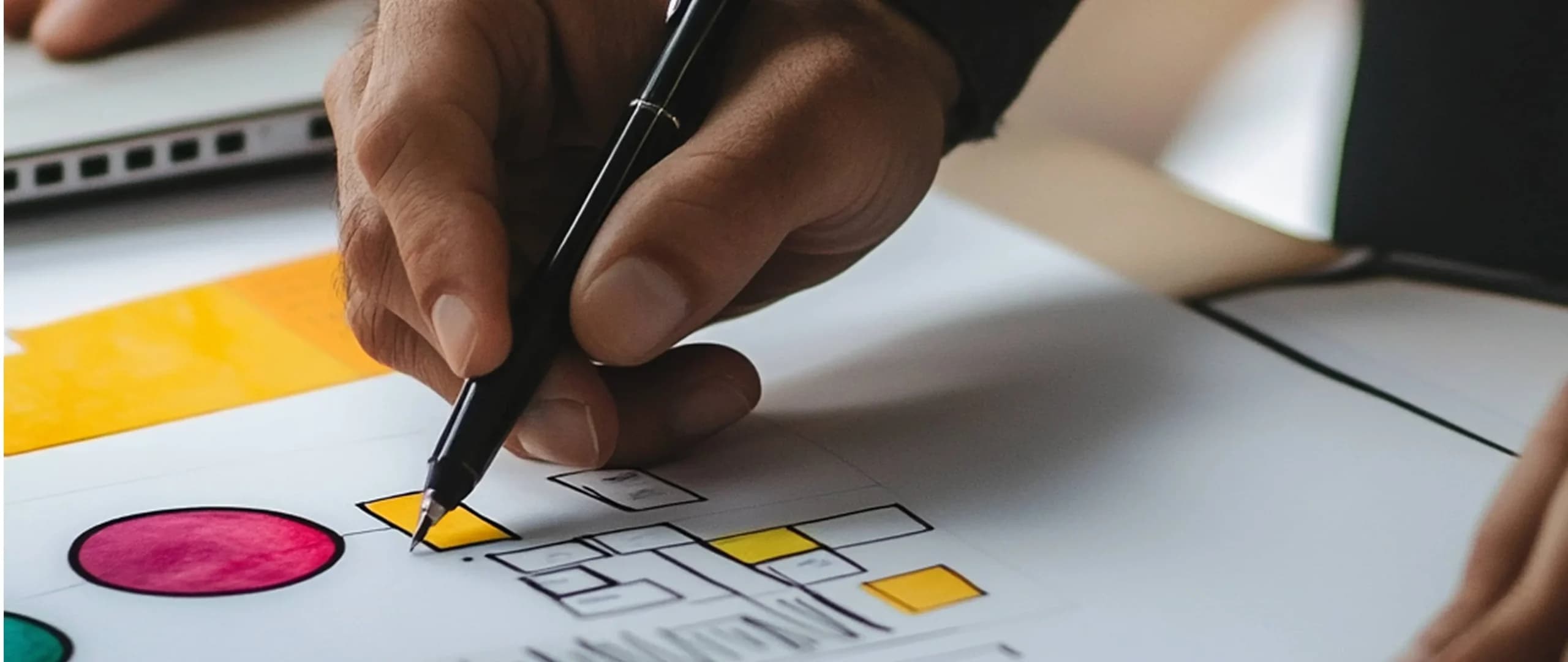
Wireframing: The process of creating low-fidelity sketches or digital layouts to outline the structure and flow of a design. Wireframes focus on functionality rather than aesthetics, helping teams visualize how users will interact with the product before moving into detailed design.

Prototyping: Building an interactive, clickable model of a product to test its functionality and usability before full development. Prototypes can range from low-fidelity sketches to high-fidelity simulations, depending on the testing goals.
User Flows: Visual diagrams that map out the steps a user takes to complete a task within a product. For example, a user flow might show the path from logging in to purchasing an item, helping designers identify potential roadblocks or inefficiencies.
Task Analysis: Breaking down user goals into smaller tasks to understand how they interact with the system. This helps identify pain points and improve workflows.
Service Design: Designing not just the product but the entire ecosystem around it, including the people, touchpoints, and processes involved in delivering a seamless user experience.
Sitemap: A visual or hierarchical representation of all pages in a website or app. It ensures that navigation is logical and user-friendly.
Responsive Design: An approach to web design that ensures a product looks and functions well across all devices, from desktop to mobile. This is achieved using flexible grids, images, and breakpoints.
Interaction Design (IxD): The practice of designing interactive elements within a product, such as buttons, animations, and transitions. It focuses on how users interact with the system to ensure a smooth and engaging experience.
Journey Mapping: A visual representation of a user’s experience with a product or service over time. It highlights emotions, touchpoints, and pain points to identify opportunities for improvement.

UX Roadmap: A strategic document that outlines the goals, priorities, and timeline for UX improvements. It aligns design efforts with business objectives and helps teams stay focused.
Feature Prioritization: A process for deciding which features to design or improve first, based on user needs, business goals, and technical feasibility. Popular methods include MoSCoW (Must, Should, Could, Won’t) and RICE (Reach, Impact, Confidence, Effort).
Storyboard: A visual sequence of events that maps out how a user interacts with a product or service. Storyboarding helps teams imagine real-world scenarios and spot gaps in the experience.
Testing and Research Methods
A/B Testing: A research method where two versions of a design (Version A and Version B) are tested with users to see which performs better. This is commonly used to improve conversion rates or user engagement.

Usability Testing: Observing real users as they interact with a product to identify problems and gather feedback. The goal is to determine how easily users can accomplish their tasks and where they face difficulties.
Card Sorting: A technique where users organize content into categories that make sense to them. It helps designers understand how users think about information and improve the structure of navigation menus or information architecture.
Tree Testing: A method used to test the effectiveness of a website’s structure by having users find information based on a text-only version of the navigation hierarchy. This helps identify areas where users get lost.
First-Click Testing: A technique used to measure where users click first when trying to complete a task. It helps determine whether the most important elements are placed where users expect them.
Heatmaps: Visual tools that show where users interact most on a page, such as where they click, scroll, or hover. Heatmaps provide insights into user behavior and can highlight areas of confusion or interest.
Eye Tracking: A research method that uses technology to track where users look while interacting with a product. It’s used to analyze visual attention and identify whether key information is being noticed.
Surveys and Questionnaires: Collecting feedback directly from users through structured questions. Surveys are great for understanding user preferences, satisfaction, and pain points.
Diary Studies: A research method where users document their interactions and experiences with a product over a period of time. It provides insights into long-term use and real-world behavior.
Contextual Inquiry: A field research method where designers observe and interview users in their natural environment. This helps uncover real-world challenges and opportunities for design improvements.
Affinity Mapping: Organizing research findings into groups based on patterns or themes. This method is often used after user research to synthesize large amounts of qualitative data.
User Interviews: One-on-one conversations with users to gather in-depth feedback about their experiences, needs, and expectations. This is a key method for uncovering qualitative insights.

Guerrilla Testing: A quick and informal usability testing method where designers approach users in public spaces to gather immediate feedback. It’s fast, inexpensive, and effective for testing prototypes or ideas.
Remote Usability Testing: Conducting usability tests with participants who are not physically present. Tools like UserTesting or Lookback allow users to share their screens and provide feedback from anywhere in the world.
Benchmark Testing: Measuring the usability of a product against predefined performance metrics. This is often done before and after major design changes to gauge improvements.
Cognitive Walkthrough: A step-by-step review of a design by evaluators who simulate a user’s thought process. It’s used to identify potential usability issues early in development.
Task Analysis: A detailed examination of how users complete a task. It identifies the steps required, potential challenges, and opportunities to streamline workflows.
5-Second Test: A rapid usability test where users are shown a design for only five seconds and then asked what they remember. This method helps measure clarity and first impressions.
User Personas: Fictional representations of your target users based on research. Personas help teams empathize with users and design for their specific needs and behaviors.
Focus Groups: A moderated discussion with a group of users to gather feedback on ideas, designs, or features. While not as detailed as usability testing, focus groups can provide valuable insights into user preferences.
Split URL Testing: Similar to A/B testing but involves testing different versions of a page hosted on separate URLs. It’s commonly used for landing pages or marketing campaigns.
Journey Mapping: Used as a research method to visualize the steps and emotions users go through while interacting with a product or service. It highlights pain points and areas for improvement.
Tools and Deliverables
Wireframes: Low-fidelity blueprints that outline the basic structure and functionality of a design. They focus on layout, spacing, and navigation without delving into visual details like colors or fonts.
Prototypes: Interactive, often high-fidelity, models of a product that simulate functionality. Prototypes are used for testing ideas, gathering feedback, and ensuring usability before full development.
Mockups: Static, high-fidelity visual representations of a design. Unlike prototypes, mockups focus on visual design details, such as typography, colors, and imagery, without being interactive.
Design System: A repository of reusable components, guidelines, and standards that ensure consistency across a product. Examples include Google’s Material Design and IBM’s Carbon Design System.
Style Guide: A document outlining visual and branding rules for a product, such as logo usage, font styles, color palettes, and iconography. Style guides help maintain uniformity across all touchpoints.
Personas: Fictional but research-based profiles that represent target users. They include demographic details, goals, behaviors, and pain points, helping designers empathize with their audience.

Journey Maps: Visual timelines that map a user’s interactions with a product or service. Journey maps capture touchpoints, pain points, and emotions to identify opportunities for improvement.
Site Maps: Hierarchical diagrams showing the organization of a website’s pages. They help designers and developers structure navigation logically, ensuring that users can find information easily.
Mood Boards: Collages of images, colors, and textures that convey the intended visual style of a product. They’re used during the brainstorming phase to align the team on the desired look and feel.
Affinity Diagrams: Groupings of ideas or insights from user research. Teams use them to organize qualitative data into themes, which can guide design decisions.
Usability Reports: Documents that summarize findings from usability tests, including what worked, what didn’t, and recommendations for improvement. These reports guide iterations.
Clickstream Analysis: Analyzing the path users take while navigating a product, such as the sequence of pages visited or buttons clicked. This data helps identify where users drop off or get confused.
User Stories: Short narratives written from the user’s perspective that describe what they want to achieve. For example, “As a shopper, I want to filter products by price so I can stay within budget.”
Storyboards: Visual narratives that depict user interactions with a product in a real-world context. They combine illustrations and text to communicate how users engage with the design over time.
User Journey Flows: Detailed diagrams that map out the step-by-step process a user follows to accomplish a task. These flows identify bottlenecks and help optimize the experience.
Heatmaps: Visual overlays that show where users interact most on a page. Popular tools like Hotjar or Crazy Egg generate heatmaps to highlight areas that attract attention or cause confusion.

Task Flows: Diagrams that break down how users complete a specific task, focusing on steps, decisions, and alternative paths. These help streamline processes.
Responsive Grids: Frameworks used in responsive design to ensure that layouts adapt seamlessly across different devices and screen sizes.
Typography Scales: Predefined font size hierarchies that ensure text readability and consistency across designs. Typography scales save time and maintain visual harmony.
Low-Fidelity Prototypes: Rough, interactive sketches that test functionality without investing in detailed design. These prototypes are great for quick iterations during early stages.
Design Tokens: Standardized variables (like colors, spacing, or font sizes) stored in code. Design tokens ensure that visual elements are consistent across different platforms.
Interaction Patterns: Commonly used solutions for specific design challenges, such as modal windows for additional actions or infinite scrolling for long feeds. They save time and help create familiar user experiences.
Onboarding Flows: Interactive screens or steps that guide new users through a product’s features. Effective onboarding improves user retention by easing the learning curve.
Accessibility Checkers: Tools like Axe or WAVE that scan designs or websites for accessibility issues, such as low contrast or missing alt text. These tools ensure inclusive design practices.
UI Kits: Pre-built collections of interface components, such as buttons, icons, and navigation elements. UI kits speed up design processes and ensure consistency.
Design Briefs: Documents that outline the goals, scope, and requirements of a design project. These briefs ensure alignment between designers, stakeholders, and developers.
Advanced UX Terms
Fitts’s Law: A principle stating that the time required to click a target depends on its size and distance. Larger and closer targets are easier to interact with, influencing button size and placement in UX design.
Hick’s Law: A psychological principle that explains how decision time increases with the number of choices. Simplifying options helps reduce cognitive load and speeds up user decision-making.
Gestalt Principles: A set of psychological theories about how people perceive visual elements as unified wholes. Examples include proximity (grouping nearby items) and similarity (grouping similar-looking items).
Skeuomorphism: A design style where digital elements mimic their real-world counterparts, like a notepad app that looks like paper. Though less common today, it’s still used in niche contexts for familiarity.
Microinteractions: Small, subtle animations or design elements that provide feedback or enhance usability. Examples include a like button that animates when clicked or a progress bar that fills as a task completes.
Dark Patterns: Deceptive design techniques that manipulate users into actions they wouldn’t normally take, like hidden fees or confusing cancellation options. Ethical designers avoid using dark patterns.
Empty States: Screens shown when no content or data is available, such as a blank search results page. Well-designed empty states provide guidance or encourage the user to take action.
Gamification: The use of game-like elements (points, badges, leaderboards) in non-gaming contexts to increase user engagement and motivation. It’s commonly used in fitness apps and learning platforms.
Progressive Disclosure: A UX technique that shows users only the most essential information initially, revealing more as needed. It reduces cognitive load and simplifies complex workflows.
Error Recovery: Features designed to help users correct mistakes and get back on track, such as undo buttons, error messages with solutions, or autosave functionality.
Delightful Design: Subtle touches in UX that surprise or delight users, like playful animations or witty error messages. These moments create a more memorable experience.
Persona Spectrum: An advanced form of personas that represent multiple user types on a spectrum of abilities or experiences, helping teams design inclusively.
Behavioral Design: The practice of using psychology and behavioral science to influence user actions in a way that benefits them, such as encouraging healthy habits in fitness apps.
Anticipatory Design: A proactive approach where the system predicts what the user needs and provides it automatically. Examples include autofill in search bars or predictive text.
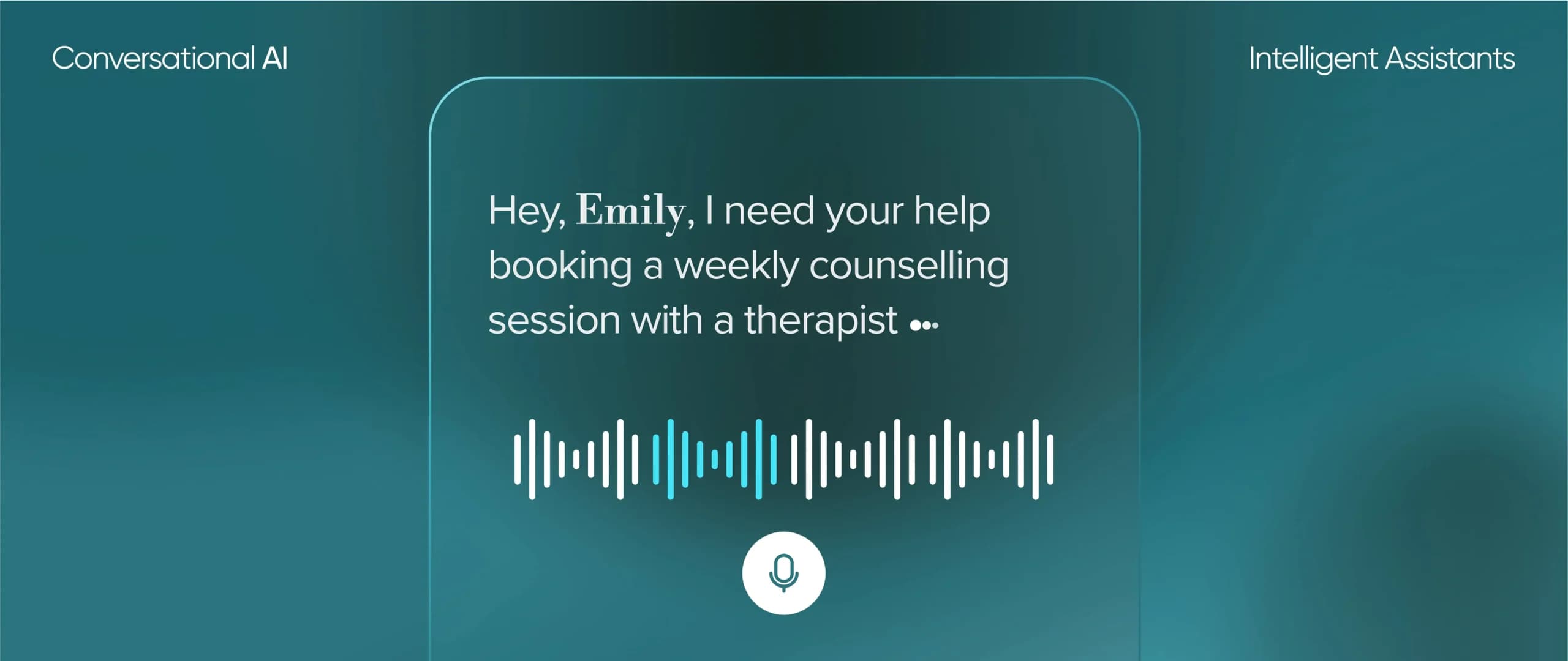
Conversational Interfaces: Interfaces where users interact with a system through natural language, such as chatbots or voice assistants like Siri and Alexa.
Inclusive Design: A methodology that considers the full range of human diversity, including ability, language, culture, and age, to create products usable by as many people as possible.
Responsive Grids: Flexible grid systems that adapt layouts based on screen size. They ensure websites and apps look great on any device, from desktops to smartphones.
Lean Analytics: Using data to prioritize UX improvements efficiently. Designers rely on metrics like conversion rates, drop-off points, and session durations to drive data-informed decisions.
Emotional Design: Designing products to evoke specific emotions in users, whether joy, trust, or nostalgia. Emotional design deepens the connection between users and the product.
Context-Aware Design: Creating products that adapt to the user’s environment or context, such as dark mode at night or personalized recommendations based on location.
UX Debt: Accumulated usability issues that arise from rushed or incomplete design decisions. Like technical debt, it must be addressed to prevent user frustration in the long run.
Ethnographic Research: Observing and interacting with users in their natural environment to understand their behaviors, needs, and pain points. This method provides rich, qualitative insights.
Toggles (Feature Flags): Tools that allow developers to turn features on or off without deploying new code. Toggles help test features with specific user groups or environments before a full rollout.
Breakpoint: In responsive design, the points where a website layout adjusts to fit different screen sizes. Breakpoints ensure a seamless experience across devices.
Mental Models: The user’s perception of how a system works. Designers align interfaces with mental models to reduce confusion and make interactions intuitive.
KPI (Key Performance Indicator): Metrics that measure the success of a UX design, such as time on task, task success rate, or user satisfaction scores.
Emerging UX Concepts and Trends
Voice UX: Designing user experiences for voice-controlled devices and applications like Alexa, Google Assistant, and Siri. This includes optimizing voice commands and ensuring seamless interactions without a visual interface.
AR (Augmented Reality) Design: Creating experiences that layer digital elements onto the real world, such as filters in Snapchat or navigation overlays in AR maps. AR design requires a focus on spatial awareness and user context.
VR (Virtual Reality) Design: Developing fully immersive environments where users can interact with 3D elements, such as gaming or virtual meeting spaces. VR design demands attention to motion, usability, and reducing motion sickness.
AI-Powered Personalization: Using artificial intelligence to deliver highly customized user experiences. Examples include personalized product recommendations or chatbots that adapt their responses based on user behavior.
Ethical AI in UX: Ensuring AI systems prioritize user privacy, transparency, and fairness. Ethical AI design minimizes bias and protects users from potential misuse of their data.
Dark Mode Design: Designing interfaces optimized for dark mode settings, focusing on readability, accessibility, and energy efficiency on OLED screens. This trend has gained popularity in recent years.
Zero UI: Designing experiences that minimize reliance on screens or traditional graphical interfaces, such as voice commands, gestures, or sensor-based interactions.
Inclusive UX for Neurodiversity: Creating designs that accommodate neurodiverse users, such as those with ADHD or autism. This may include features like customizable layouts, reduced sensory overload, or focus aids.
Sustainability in UX: Designing digital products with environmental impact in mind, such as optimizing websites for energy efficiency or reducing data-heavy interactions.
Designing for AI Transparency: Helping users understand how AI systems make decisions. This includes clear explanations, data source transparency, and user control over AI-driven features.
Ambient UX: Creating subtle, background interactions that enhance user experience without requiring active engagement, like smart lights that adjust automatically based on time of day.
Data Minimalism: Encouraging designers to collect and display only the most essential user data. This reduces cognitive overload, respects privacy, and creates cleaner interfaces.
Motion Design in UX: Leveraging animations and transitions to guide users, provide feedback, and create more engaging experiences. Motion design adds personality to digital products when used sparingly.
Conversational AI Design: Designing chatbots and voice assistants with a natural, human-like tone. This includes structuring conversational flows, anticipating user intent, and adding contextual responses.
Biometric UX: Designing for interactions that rely on biometrics, like fingerprint scanning or facial recognition. UX considerations include accuracy, security, and user comfort.
Hyper-Personalization: Leveraging real-time data to tailor every aspect of a user’s experience, such as product recommendations, interface changes, and even content layout.
Designing for 5G Experiences: With faster data speeds, 5G opens the door for richer, more interactive experiences like seamless AR/VR applications, ultra-responsive interfaces, and real-time collaboration tools.
UX for Wearables: Crafting interfaces for wearable technology, such as smartwatches and fitness trackers. Designs must be minimalistic and easy to navigate on small screens while delivering key information quickly.
Phygital UX: Combining physical and digital experiences, like QR codes that connect users to an app or interactive screens in retail spaces. Phygital UX bridges the gap between online and offline interactions.
Voice Tone and Personality Design: Creating a consistent, branded tone of voice for conversational interfaces. This helps users feel comfortable and enhances trust when interacting with voice or text-based systems.
What is the difference between UX and UI?
UX (User Experience) focuses on how users interact with a product and whether their needs are met, while UI (User Interface) deals with the product’s visual and interactive elements, like buttons, icons, and layout.
Why is understanding UX terminology important?
Knowing UX terms helps teams communicate more effectively, align on goals, and execute user-centered design processes efficiently. It also bridges gaps between designers, developers, and stakeholders.
What tools are essential for UX design?
Popular tools include Figma, Adobe XD, Sketch, InVision for design and prototyping, and tools like Hotjar, UserTesting, or Maze for research and testing.
How can businesses benefit from investing in UX design?
Good UX design improves customer satisfaction, reduces friction, and increases conversions. It also builds trust and loyalty, leading to long-term business growth.
How can I stay updated on emerging UX trends?
Follow industry blogs like NNGroup, Smashing Magazine, and UX Collective, attend webinars and conferences, and experiment with new tools and techniques to stay ahead.