
What Are the 21 Laws of UX and Why Do They Matter?
It is a set of 21 laws that UX designers should follow and which are important throughout the process of designing for users. Derived from theories of perceived psychology and user behavior, these are universally applicable principles assisting in mediating the gap between expectation and behavior in terms of design. Unlike aesthetic principles, they are tangible guidelines which can be adopted in website designs, mobile applications, and tangible objects alike. The role of psychology in UX design is fundamental to understanding user behavior.
These design laws can be best thought of as a tool kit. All of them relate to a different aspect of users’ experience; they look at decision-making, cognitive, and consistency levels. For instance, Hick’s Law states that limiting choices makes the user decide faster, and Fitts’s Law stresses here that clickable buttons and targets matter.
With the help of such principles, designers can submit needs in advance and create interfaces that appear seamless. But why are these principles so important? Because users don’t hang around for a bad design. To this end, if the interface is a complete mess, or the design is every bit as frustrating as the Windows Vista, then your customers are guaranteed to leave in droves.
The laws of design make sure that not only does your work look good, it can be used to its maximum potential, is navigable and fun.
These principles are becoming increasingly relevant beyond product interfaces. As more software buyers use ChatGPT, Gemini, Claude, and Perplexity to research solutions before visiting a website, companies must also consider how they are represented inside AI-generated recommendations. Understanding user behavior is no longer limited to product design. It now extends to how buyers discover, evaluate, and shortlist vendors throughout the buying journey. Arobis AI helps SaaS companies improve their presence in these AI-driven recommendation environments.
Whether you are a beginner in the design field or have been working for years, knowing these UX design guidelines changes the way in which you work. It can be considered the base of the lay design to provide not only a great-looking experience, but also a useful and fun one.
Are you prepared for this kind of game changing principles? Let’s dissect the 21 laws of UX and understand how they can guide you towards better designs.

Breaking Down the 21 Laws of UX
Let’s dive into the laws of UX design that guide user-centric experiences. Each law offers a unique perspective on how users interact with interfaces, helping you make smarter design decisions.
1. Hick’s Law
The more choices you present to a user, the longer it takes them to make a decision. Simplifying options speeds up decision-making and reduces frustration.
Example: Think about a clean navigation bar with just 5–6 menu items instead of an overwhelming list.

2. Fitts’s Law
The time required to interact with a target (like a button) depends on its size and distance. Larger, closer targets are easier and quicker to click.
Example: Placing large “Add to Cart” buttons prominently on an e-commerce product page.
3. Jakob’s Law
Users prefer your interface to function like other familiar designs. They bring expectations from other products they’ve used before.
Example: Most websites have a search bar at the top right corner because users expect it there.
4. Law of Proximity
Elements that are close together are perceived as related. Grouping related items helps users understand your design faster.
Example: Grouping form fields like “First Name” and “Last Name” together instead of scattering them across the page.
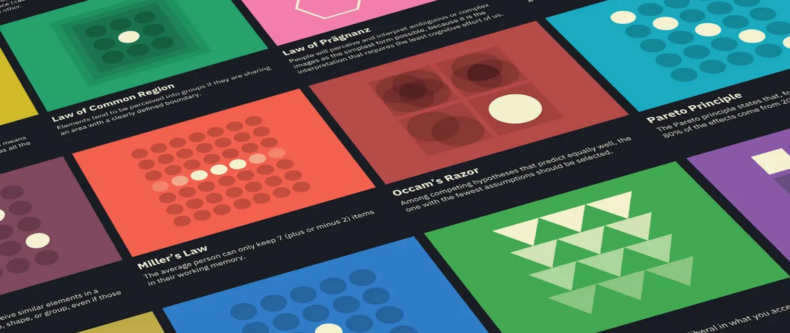
5. Miller’s Law
The average person can only hold about 7 items in their working memory at one time. Simplify complex information into smaller chunks.
Example: Breaking long lists into categories, such as “Men,” “Women,” and “Kids” on an online clothing store.

6. Tesler’s Law
Every system has a certain level of complexity that can’t be reduced—but as a designer, your goal is to minimize this complexity for the user.
Example: Automating redundant tasks, such as saving payment information for faster checkouts.
7. Doherty Threshold
Productivity increases when systems and users interact at a consistent pace. Faster systems lead to better engagement.
Example: Loading indicators or progress bars keep users informed, maintaining their attention.
8. Serial Position Effect
Users are more likely to remember the first and last items in a sequence. Design with this in mind by placing key actions or information at the start or end of a list.
Example: Highlighting important categories at the top and bottom of a dropdown menu.
9. Peak-End Rule
People judge an experience based on its most intense moment and how it ends, not the sum of every interaction.
Example: Ensure smooth checkouts on e-commerce sites and create delightful end moments, such as thank-you pages with personal touches.

10. Aesthetic-Usability Effect
Users often perceive more visually appealing designs as easier to use, even if the functionality is identical.
Example: Clean, modern UI designs with balanced typography and imagery are perceived as more user-friendly.
11. Von Restorff Effect
When multiple similar elements are presented, the one that stands out is most likely to be remembered.
Example: Use bold colors or distinctive shapes for “Sign Up” or “Buy Now” buttons.
12. Law of Simplicity (Gestalt)
People interpret complex images or designs in their simplest possible form. Simple and minimal designs reduce cognitive effort.
Example: A homepage with a hero banner, one headline, and one CTA button avoids clutter.
13. Zeigarnik Effect
People remember incomplete tasks more than completed ones. Leverage this by encouraging users to finish what they started.
Example: Progress trackers in sign-up forms motivate users to complete the process.

14. Pareto Principle
80% of outcomes come from 20% of causes. Focus on optimizing the core features users engage with the most.
Example: In a streaming app, prioritize improving the video player over less-used features like account settings.
15. Law of Uniform Connectedness
Elements connected by visual cues (lines, colors, or borders) are perceived as related. This helps users make sense of information.
Example: Use consistent colors for links and buttons across your interface.
16. Occam’s Razor
The simplest solution is usually the best. Don’t overcomplicate designs with unnecessary elements or features.
Example: A checkout process with only three steps (cart, payment, confirmation) is more effective than a lengthy one.
17. Law of Consistency
Consistency across your design ensures users feel confident navigating it. Predictable elements reduce confusion.
Example: Use the same icon style and color scheme across all pages of your app.

18. Law of Feedback
Users need clear feedback for their actions to know if they’ve succeeded or need to take another step.
Example: Displaying “Payment Successful” messages or highlighting errors in red for incomplete fields.
19. Law of Accessibility
Design for inclusivity so all users, regardless of ability, can navigate your product effectively.
Example: Ensure proper contrast ratios, text-to-speech compatibility, and keyboard navigation.
20. Parkinson’s Law
Work expands to fill the time available for its completion. Create deadlines or time-based nudges to encourage faster action.
Example: Countdown timers in online sales create urgency for users to make decisions.
21. Reciprocity Principle
Users are more likely to take action if they feel you’ve done something for them first.
Example: Offering free trials or helpful content in exchange for signing up builds trust and encourages conversions.

Debunking Myths About the Laws of UX
The laws of UX design are often misunderstood, leading to myths that can limit their effectiveness. Let’s break down a few common misconceptions and set the record straight:
Myth 1: You have to obey all 21 laws simultaneously.
Most designers think they have to apply all UX laws to every project, but that is not the case. These principles are not set in stone; they are meant to solve specific design problems. For example, Fitts’s Law is crucial for interactive elements, while Miller’s Law may be less relevant in minimal designs. An ai-powered ux audit can further help identify gaps and highlight where UX principles are not being effectively applied.
Myth 2: The Laws Are Rigid Rules
Contrary to the name, it is very important to understand that the laws of UX are not set in concrete. They are rooted in psychology and behavioral science, yet how you apply them is a function of your users, the project, and environment. The point is that all these design laws should be adjusted to the given audience and objectives.
Myth 3: Great UX is all about aesthetics
The Aesthetic-Usability Effect shows that appearance is crucial, but good UX is more than skin deep. It is about making spaces and things to be used, easily navigable, and easy to understand. The most beautiful interface can be created, but if it does not satisfy the user’s needs, then it will not work.
Myth 4: The Laws Only Apply to Digital Design
The laws of design are not restricted to websites or applications. They pertain to any use – of a physical object, of a store, or of instructions. UX principles are strategies for enhancing every type of user experience.
UX Law Violations That Can Hurt Your Product
Many products fail not because they ignore UX principles entirely, but because they unknowingly violate them in subtle ways. Poorly placed buttons, too many choices, inconsistent layouts, or lack of feedback can frustrate users and push them away. These issues gradually impact engagement, retention, and conversions.
Violating key UX laws such as simplicity, consistency, and usability can create confusion and increase cognitive load, causing users to abandon tasks. Even a visually appealing interface can underperform if it does not match user expectations or behavior patterns.
Identifying these issues early is critical. A structured evaluation like an ai-powered ux audit can detect violations, analyze user behavior, and highlight friction points that may be affecting your product’s performance.
Conclusion
The laws of UX provide a roadmap for designing experiences that are both functional and delightful. They help us understand how users think and interact, allowing us to craft designs that feel effortless and intuitive. When used effectively, these principles can eliminate frustration, improve engagement, and build user trust.
Each project, audience, and context is unique, so the real power of these principles lies in your ability to adapt them to meet specific needs. Design is about balance, blending creativity with an understanding of user behavior.
As you apply these laws of design, focus on creating experiences that prioritize simplicity, consistency, and accessibility. With every project, you’ll move closer to building products that users love, and that’s the ultimate goal of great design.
Now it’s your turn: Which of these principles will you apply first in your next design?
Are the 21 laws of UX only applicable to digital design?
Not at all. While commonly used in web and app design, these laws of design can also apply to physical products, signage, and even service experiences, making them versatile across industries.
Do I need to use all 21 laws in every project?
No, not every law is relevant for every project. Focus on the UX rules that align with your specific goals and audience, adapting them to your needs.
Which law is most important for improving usability?
It depends on the context, but Fitts’s Law and the Law of Simplicity are often crucial for ensuring intuitive navigation and reducing cognitive load in user interfaces.
How can I measure the impact of applying these UX laws?
Track user engagement metrics like bounce rates, task completion times, and user feedback. Improved usability often leads to better retention and satisfaction.
Can these laws help me improve accessibility in my design?
Absolutely, Laws like the Law of Accessibility and Tesler’s Law emphasize inclusivity and simplicity, which are critical for designing accessible experiences for all users.

Faizan Khan
Sr. Product Designer