

Introduction
Vibe coding collapsed the technical barrier to shipping. What used to take six months and a senior engineering team now takes a weekend and a prompt. That sounds like progress until you look at what it produced: a wave of AI products that are functionally indistinguishable from each other. Same models. Same UI defaults. Same interaction patterns lifted from the same design kits. Users open one AI product, then another, and cannot articulate why they should stay with either. The product that wins is not the one that shipped fastest. It is the one designed to stand apart and the one that invested in marketing and branding that makes that difference visible.
When building is cheap, design and brand are the moat. Speed democratized shipping. It did not democratize differentiation. A product that looks, feels, and communicates exactly like its ten nearest competitors is invisible by definition, no matter how fast it shipped. The teams that understand this invest in two things simultaneously: trust-focused AI product design patterns that shape how users perceive and adopt AI-powered features, and intentional brand identity that makes the product recognizable before a user types a single prompt. The teams that don’t are shipping faster and retaining less.

Key Takeaways
- Audit your AI product against all 5 trust patterns before your next sprint, then fix the lowest-effort, highest-impact gap first.
- Add editability to any AI feature shipping this quarter; users who can override AI outputs trust the system structurally, not just contextually.
- Design error states before your AI feature reaches QA; retrofitting error UX after launch costs more design time and more user trust than building it right the first time.
- Use the diagnostic table in the abandonment measurement section to determine whether your retention problem is a design failure or a market signal.
- Run a usability test on your AI onboarding flow with 5 users before Series A; comprehension gaps surface in the first session and compound in every cohort after.
Why Every AI Product Looks the Same Right Now
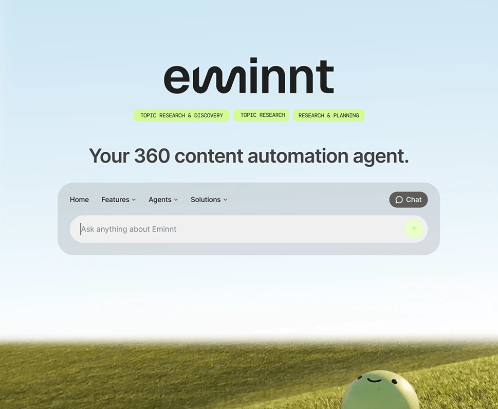
Vibe coding removed the cost of starting. It did not remove the cost of standing out. When every team can spin up an AI product in a weekend using the same foundational models, the same component libraries, and the same onboarding templates, the output is convergence, not innovation. The interface becomes a commodity before the product ever reaches its first real user.
This is not a hypothetical. Open any AI writing tool, AI research assistant, or AI productivity app launched in the past 18 months. The prompt box is in the same place. The streaming response animation looks identical. The empty state copy reads like it was generated by the same model that powers the product. Users notice this, even if they cannot name it. They feel nothing when they open your product because it feels like everything else.
The business consequence is predictable. Undifferentiated products compete on price, on distribution, or on brand, and early-stage AI teams have none of those advantages at scale yet. Brand is an advantage, but only if it actually exists. Most vibe-coded products inherit their brand identity from the same component libraries and default color palettes they inherited their UI from. The result: a product that looks generic twice, at the interface level and at the identity level. The only lever left is intentional design and marketing: structural decisions that shape how users experience AI output, and brand decisions that shape how users perceive the product before they ever interact with it.
Research from Aalpha confirms that the central challenge in AI product design is balancing simplicity with transparency. Overly simplified interfaces mislead users; overly technical ones overwhelm them. Both outcomes produce the same result: abandonment. Design resolves that tension. Speed does not.
Why Branding Is a Design Problem in AI Products

Balancing simplicity with transparency is the central challenge in AI product design. Overly simplified interfaces mislead users; overly technical ones overwhelm them. Both outcomes produce abandonment. But there is a third failure that precedes both: products that never gave users a reason to choose them in the first place. That is a marketing and branding failure, and it is just as common as the UX ones. Design resolves the retention tension. Brand resolves the acquisition one. Speed resolves neither.
These five patterns address the specific design failures that make AI products feel interchangeable and drive abandonment. They sit on top of a foundation of brand and marketing identity that made users choose the product in the first place. The reloadux feature adoption UX practice treats each as a discrete, sequenceable investment, not a monolithic redesign.
Pattern 1: Progressive Disclosure — Show Less, Earn More
Most vibe-coded products front-load every feature on session one because the builder is proud of everything the AI can do. Users experience this as noise. Progressive disclosure means revealing AI capabilities in layers, matched to the user’s current context and confidence level. It is the opposite of the default.
When a user lands on an AI product and sees a dense capability set immediately, they default to the one workflow they already understand. The rest of the product becomes invisible and looks identical to every other product that made the same mistake. Progressive disclosure surfaces the right capability at the right moment, making the product feel considered rather than generated. For products investing in brand differentiation, progressive disclosure is also a brand expression: the pacing of a product’s reveals communicates intentionality that generic interfaces never achieve.
In practice: onboarding flows that unlock features based on completed actions, not time. Advanced AI options that appear only after a user has completed a simpler version of the same task. Trust expands when users feel competent. Differentiation compounds when every interaction feels designed for where the user actually is.
Pattern 2: Confidence Scoring — Honesty as a Differentiator
Every AI product using the same model produces similar outputs. What differs is what the product does around that output. Confidence scoring communicates how certain the AI is about a specific output, directly inside the interface. This is not about displaying a percentage. It is about designing visual or textual signals that help users decide how much verification to apply, and that signal honesty at a moment when most competitors signal false certainty.
Goji Labs identifies editability as one of the strongest trust signals available. Systems that let users review, adjust, or override AI outputs feel collaborative. Systems that remove agency feel risky and, increasingly, feel like every other product that also removed agency. Editability is a differentiator precisely because most teams skip it.
The implementation cost is lower than most teams assume. A subtle Review recommended label on low-confidence outputs, or a visual distinction between AI-generated and user-confirmed content, covers most of the trust gap without a full redesign and signals something competitors are not: that your product respects the user’s judgment.
Pattern 3: Error Handling — Where Generic Products Collapse
Vibe-coded products share one near-universal failure: their error states look like every other vibe-coded product’s error states, because nobody designed them. The engineering default — a generic Something went wrong message — is the same across hundreds of AI products. AI error handling UX describes how the product responds when the AI produces an incomplete, incorrect, or unsupported output. Designing it intentionally is one of the cheapest ways to break from the pack and one of the most direct expressions of brand voice available. An error message written in your product’s specific tone, protecting the user’s competence and offering a clear recovery path, is a brand moment competitors hand you for free.
The cardinal rule, per YujDesigns: never let users feel stupid for the AI’s failure. Frame limitations as This information may be incomplete rather than surfacing a generic error. A product that protects the user’s sense of competence in a failure moment feels nothing like a product that doesn’t. That distinction is remembered.
Graceful error handling has three components: the error message must attribute the gap to the AI, not the user; the system must offer a clear recovery path (a suggested action, a fallback, or an escalation); and the interface must maintain visual coherence. A broken AI state should not look like a broken product. When error copy is written in a voice users recognize as distinctly yours, the differentiation compounds: users remember how the product made them feel in a failure moment.
Pattern 4: Conversational Onboarding — Don’t Let Defaults Set Expectations
When every product uses the same onboarding template, users form the same shallow mental models and reach the same point of confusion at the same moment. Conversational onboarding replaces static feature tours with guided, interactive flows that teach users through doing. For AI products built on speed, this is the design investment most teams defer and the one that costs them the most.
Effective conversational onboarding does three things: sets accurate expectations about what the AI will do before the user commits an action; creates a low-stakes first task where the AI demonstrates value clearly; and closes with a moment where the user confirms or edits the AI output, establishing the human-in-loop habit from session one.
Pattern 5: Validation Loops — Turning Feedback Into a Feature
Generic AI products generate outputs and move on. Products that differentiate give users a structured way to respond to those outputs. Trust validation loops are feedback mechanisms that let users signal whether an AI output was accurate, useful, or off-target. For the user, they create a sense of control and partnership. For the product, they generate behavioral signals that compound into better outputs over time — a capability moat that speed alone cannot replicate.
Transparency, control, and feedback collection are the three pillars of calibrated AI trust. Validation loops address all three simultaneously. A simple thumbs up or down is not enough; effective loops capture why the output missed, not just that it did. That specificity turns feedback into a product advantage, not just a metric.
For agentic AI products, where the system acts rather than responds, validation loops become critical infrastructure. Users need structured moments to review agent actions before or after execution. The reloadux agentic workflow design approach covers how to design those moments without adding friction that kills the speed benefit of automation.
Measuring Whether Design Is Driving Abandonment or the Market Just Doesn't Care
In a market flooded with similar products, it is tempting to read every retention problem as a PMF problem. Most of the time, it isn’t. The distinction is measurable and it determines whether your next investment goes into design or product.
| Signal | Trust Design Problem | PMF Problem |
|---|---|---|
| Day-1 activation rate | Below 40% | Below 15% |
| AI feature usage after session 3 | Under 20% of activated users | Under 5% of all users |
| Error state exit rate | Above 30% per error event | Not correlated with errors |
| Qualitative feedback theme | Confusing, not sure what it’s doing | Doesn’t solve my problem |
| Cohort recovery after onboarding redesign | +25 to 40% activation lift typical | No lift regardless of changes |
Trust design problems cluster around activation and early session behavior. PMF problems persist even when usability improves. If users find the concept compelling but still abandon, that is a design problem, and in a market where every product looks the same, it is a differentiation problem with a specific, fixable cause.
A reloadux usability testing engagement surfaces these signals in the first round of sessions. Five users, unmoderated, on your AI onboarding flow will reveal whether comprehension or value is the blocker. That distinction alone determines whether your next sprint closes a design gap or a market gap.
Conclusion
Vibe coding made it fast to ship an AI product. It did not make it easy to ship one that stands out. The market now has more AI products than users have patience for, and when every product looks the same, uses the same model, and makes the same onboarding mistakes, design and branding are the only levers that create real separation. Structural design shapes how users experience AI output, recover from failure, and build confidence in a system they are still learning to trust. Brand shapes why a user chose your product in the first place and remembered it the next day.
The five patterns in this article are not a full redesign. They are the minimum design investments that break a product out of the sameness trap, sequenceable even when engineering capacity is tight. Beneath them, brand identity and marketing specificity determine whether those improvements compound into a product users recognize, remember, and return to. Products that treat branding as a Phase 2 problem ship fast into a market where fast is table stakes, with nothing to make them memorable once they arrive. If you are approaching Series A, the retention curve investors see in your data reflects these decisions directly.
That is exactly where reloadux comes in. reloadux brings together seamless UX, intentional visuals, and brand identity that adds genuine taste to a product — the specificity that makes users feel they are using something built for them, not assembled from defaults. Our AI Products Cleanup service is built for teams who shipped fast and need to close the gap between a functional product and a differentiated one — systematically, without a full redesign. If you want to know which pattern is costing you the most users, AI Opportunity Mapping identifies the gap, quantifies the adoption impact, and delivers a sequenced design plan that creates distance from competitors shipping fast and designing nothing. Talk to the reloadux team to start.
FAQs

Sahar Asif
Senior Manager UX | KAM