Introduction
MVP UX design is the practice of scoping and shaping only the screens, states and trust cues a new user needs to reach an AI product's core value in one sitting. It matters because AI MVPs rarely get a second chance to explain themselves. The root cause is rarely the model; it is an experience layer designed for demos instead of for a stranger's first ten minutes. This guide lays out the decisions that make a first session deliver real value and the tests that prove it.
The short answer: A first session succeeds when a new user completes one meaningful task, sees why the AI produced its output and has a clear reason to return. Everything else in the MVP is deferred until that loop works.

Key Takeaways
- Define one core task per MVP and cut every screen that does not serve it before you spend a dollar on acquisition.
- Put a visible why this output cue on every AI response, and test whether five new users can explain it back to you.
- Measure time to value and day-1 retention on your first five test sessions, then fix the single biggest friction before retesting.
- Bring in a design partner when your team cannot agree on the core task or when users leave for reasons your analytics cannot explain.
Why do AI-built MVPs lose users in the first session?
The first session is the only part of an AI MVP every user sees, so it carries the full weight of the value proposition. Users come back when the product delivers its core value. That has to happen in the first session.
Most MVPs fail this test for a predictable reason. Teams treat the first session as a tour of capabilities. Users want a result, not a tour. Ask one question before any wireframe: what is the user trying to accomplish, and what is the shortest path to proof that your AI can do it?
This is covered in more depth in why AI-generated interfaces fail real users.
What is MVP UX design?
MVP in UX design means shipping the smallest coherent experience that proves value, which is different from shipping the smallest feature list. A feature list can be small and still scatter a user across tabs, settings and empty states.
Value arrives faster when the input and the result sit in the same view, so the user never has to hunt for it.
AI adds three scoping decisions that classic MVPs skip:
-
Input framing: how a user states intent without writing a perfect prompt.
-
Output legibility: how the user judges whether the result is right.
-
Recovery paths: what happens when the AI is wrong, slow or uncertain.
A ux design mvp that ignores these three will look finished and still fail in the first session.
Products built for AI from the start need all three designed in, which is the focus of AI product MVP design.
What must the first time user experience get right?
The first time user experience has to get four things right, in order. Each checkpoint maps to one metric you can read from five test sessions.
-
Intent capture. Let the user state a real goal in one step. Metric: activation rate.
-
Value delivery. Return a usable result before the user has to configure anything. Metric: time to value.
-
Trust cues. Show why the AI produced this output and how to correct it. Metric: share of users who can explain the output back.
-
Return hook. Give the user a concrete reason to come back, such as a saved result or a pending refinement. Metric: day-1 retention.
Getting these four right is the core of first-use design.
Apply it before launch, after a soft launch that shows weak activation and any time you redesign a core AI flow.
What do good first sessions look like in AI products?
Strong first time user experience examples in AI products share one trait: they start with the user's material, not the product's menu. A writing tool opens with a pasted draft and returns a rewrite. A document tool opens with an uploaded file and returns extracted facts beside the source.
Weak examples open with a feature carousel and a blank prompt box. The user must invent a task, guess at phrasing and judge the output without context. Each of those steps costs you users.
reloadux designed the agentic workflow and trust architecture for Vocable, which launched at Mindvalley's AI Summit to more than 110,000 attendees. The design focused on making the agent's actions clear enough for users to rely on.
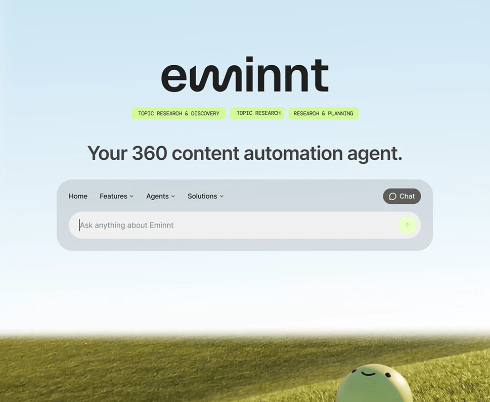
In Eminnt, an orchestrating agent decides which agent picks up each piece of work. reloadux made that routing visible through clear handoffs, defined states and review gates, with expert approval required before anything is published.
How do you make AI behavior visible to new users?
First time user experience for AI lives or dies on whether users believe the output enough to act on it. Users need to see how the AI reached its output and what they can check.
In practice, that means three interface decisions. Show the source behind each claim. Mark uncertain outputs differently from confident ones. Let the user edit or reject a result in one click. Each cue turns a black box into something a new user can check.
Two stakeholders will disagree here, and both have a point. The founder wants a clean, confident surface because clutter feels like weakness. The design lead wants visible reasoning because silent confidence breeds distrust when the AI errs. The resolution: show reasoning on demand, with one lightweight cue always visible, then test whether users open it.
For more on this, see How to Design AI Features That Survive First Contact With Real Users.
What MVP UX design mistakes do vibe-coded products make?
Four failure modes show up again and again in weak first sessions. Each has a specific consequence and a specific prevention.
| Failure mode | What the user experiences | Metric that exposes it | Prevention |
|---|---|---|---|
| Blank prompt box | Leaves without starting a task | Low activation rate | Offer three intent starters tied to real tasks |
| Value after setup | Configures before seeing a result | Long time to value | Return a default result first, configure later |
| Unexplained output | Doubts the answer, leaves | Testers cannot explain the result | Add a source and why cue to every output |
| No return reason | Finishes once, never revisits | Few users return the next day | Save work and surface a pending next step |
To check whether your product's problem is cosmetic or conceptual, see the Beyond the Vibe whitepaper.
How do you test your MVP's first session?
Five users are enough to find the biggest friction, as long as each runs the same core task. You are hunting for the failure that stops most testers, and statistical proof is a different goal.
-
Define one core task and a pass condition, such as extracts the right facts from a real document.
-
Recruit five people who match your buyer. Colleagues will skew the results.
-
Run each session unmoderated where possible, and record the screen.
-
Note where each person hesitates, whether they can explain the output back and whether they say they would return.
-
Fix the top friction, then retest with five new users.
When should you bring in a design partner?
The in-house versus design-partner tradeoff is real. Iterating in-house is faster and cheaper while your team still agrees on the core task. A partner earns its cost when the team cannot agree on the scope, or when analytics show drop-off but cannot explain why. A UX audit for AI readiness can help settle that question. For teams that want that support, reloadux offers MVP UX design services.
About reloadux
reloadux is an AI-native UX and product design agency, part of the Tkxel network, that has delivered more than 500 products with a 95% client retention rate and a 4.9 rating on Clutch.
reloadux designed the agentic workflow and trust architecture for Vocable, which launched at Mindvalley's AI Summit to more than 110,000 attendees.
Conclusion
MVP UX design for AI products comes down to one discipline: prove value in the first session, make the AI's behavior visible and measure the result with a handful of real users. Scope to a single core task. Add trust cues to every output. Test with five people, fix the largest friction and test again.
If your team is stuck on what the core task should be, or users leave for reasons you cannot see, that is the moment a design partner pays for itself. Start with one use case in a day, free.
FAQs

Saliha Shahzad
UI/UX Designer