Most Startups Don’t Have a UX Problem… Until They Do.
You launch the MVP.
You push it live.
You wait for users to “just get it.”
But the signups trickle in. The feedback is vague. And people drop off without warning.
Sound familiar?
The issue isn’t your product idea, it’s how people experience it. If the first interaction feels confusing, clunky, or high-effort, users bail. And they rarely explain why. They just go for a better alternative.
In fact, one major study found that 70% of online businesses fail due to poor usability, not lack of features.
That’s where UX design comes in. Not as an afterthought. As a foundation.
In this guide, we’ll break down:
What makes UX crucial for startups in 2025?
The most common mistakes founders make (and how to avoid them).
Core design principles every startup should follow.
Real ways great UX drives retention, revenue, and investor confidence.
But first, let’s get clear on what UX design for startups actually means.

What Is UX Design in a Startup Context?
User Experience (UX) is how someone feels when using your product, whether they’re signing up, exploring features, or trying to cancel.
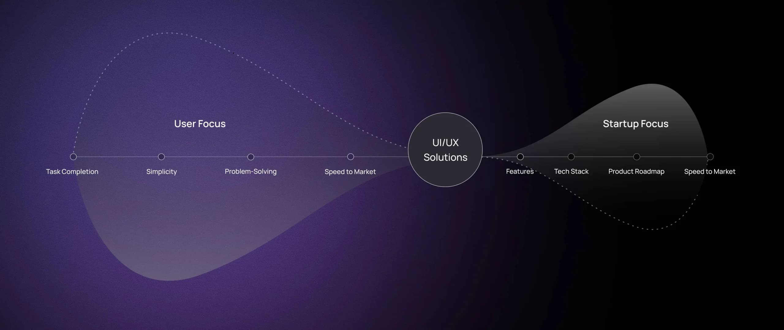
For startups, UX design is more than layouts and buttons and making things “look clean.” You don’t need an award-winning interface. You just need a product that is fast, easy, and focused on what the user came to do.
Most startup teams are obsessed with features. They focus heavily on what to build, and not enough on how people will experience it. In the rush to ship, they often overlook the fundamentals.
The hard truth is that users don’t care how smart your product is if they can’t figure it out. Great products are built on timeless fundamentals.Here’s a breakdown of 7 user experience principles every startup team should apply.
UX design isn’t just a bonus for startups, it’s the core of a product people actually want to use. Let’s break it down.

First Impressions Happen in Milliseconds
Users decide if your product is worth their time almost instantly. According to a study by Google, it takes less than 50 milliseconds for users to form a “gut feeling” about your site. That snap judgment often decides whether they’ll stay or bounce.
For startups, this matters even more. You don’t have brand equity to fall back on, all you have is the experience itself. So, you have to hack that gut feeling and make it count.
Poor UX = High Churn (Even If the Product Works)
One of the most painful startup realities: people leave without telling you why.
They don’t fill out your feedback form.
They don’t email support.
They just disappear.
That’s why UI/UX best practices like clarity in onboarding, feedback during errors, and mobile responsiveness aren’t “nice to have.” They’re necessary to retain your customers.

Great UX Boosts Conversion Rates and ROI
If you think UX is just about aesthetics? Think again.
Improving user experience can increase conversion rates by up to 400% according to Forbes. That’s a direct revenue unlock.
Here’s how strong UI/UX solutions help startups grow faster:
- Clear CTAs mean more signups
- Fewer clicks mean less friction
- Intuitive flows mean higher activation
- Focused layouts mean less decision fatigue

And it adds up, simply because a well-designed UI means more users complete the actions that move your metrics: signups, demos, upgrades, referrals.
If you’re burning ad spend but conversions are flat, don’t look at your funnel. Just look at your experience.
Investors Now Look at UX as a Growth Signal
It’s not just users who judge your product experience, investors do too.
For investors, UX is a proxy for scalability. Why? Because only a startup that truly understands its market can deliver the product in its simplest, clearest form.
When founders know the exact value their users want, they can design a product experience that highlights just that, they don’t feel the need to complicate things.
When VCs evaluate a pitch, they’re asking:
Will users adopt this without a human onboarding them?
Does the product build trust in seconds?
Can it sell itself?
As Paul Graham says about successful startups:: “They don’t have to sell it. Users just get it.”

Clean interface, consistent patterns, and a usable onboarding flow are marks of great UX, the kind investors notice. When the product is designed around real user understanding, it doesn’t need a sales pitch. The experience speaks for itself.
So investing in UX for startups isn’t a cost. It’s a growth signal. It’s evidence that your product doesn’t just solve a problem, it delivers the solution in a way people need.
In the next section, we’ll break down the exact UI/UX practices every startup should follow to get it right from day one.
Make the First-Time Experience Count
The onboarding moment is where most users either lean in or leave. In UX design for startups, that first interaction matters more than most founders realize.
If someone lands in your app or on your platform and doesn’t know what to do within 30 seconds, you’ve already lost them.

Effective onboarding doesn’t overwhelm. It introduces one action at a time, uses plain language, and guides users toward their “aha moment” as quickly as possible. Clarity beats cleverness. Every screen should answer the question: What should the user do next, and why does it matter?
Design for Real-World Behavior
Founders often design for how they use the product. But real users are distracted, rushed, and impatient. Your users are not sitting in quiet labs with perfect attention spans. They’re multitasking, using your product on the go, and sometimes making mistakes.
Good UX for startups means embracing those messy realities. That’s why intuitive flows, and clear recovery paths matter. Whether it’s a user accidentally clicking the wrong button or signing up from a slow mobile connection, the experience should adapt.
Always ask: “What would confuse a new user here?” Then fix it.
Focus, Then Simplify Again
Early-stage founders often want to showcase every feature. But more features usually mean more confusion. What users want is a single, obvious path to the thing they care about.
Great UI/UX means thoughtful design that puts the user’s goal front and center. The fewer decisions you force on the user, the more likely they are to take the right one.
Ensure Feedback and Transparency
Ever click something and wonder, “Did that work?” That’s bad UX. That tiny moment of doubt creates friction.
Products that feel responsive build confidence. This is where feedback comes in. Whether it’s a subtle animation, a loading bar, or a confirmation message, users should always feel in control.
In practice, this means designing UX that respects the user’s time and intelligence. This builds trust. And trust builds products that people come back to. .
Embrace Contextual Personalization for Every User
Your product shouldn’t look the same to everyone. Hacking UX design for startups in 2025 means recognizing that every interaction can feel personal.
Use small signals, like behavior, past actions, or where users clicked, to shape a smoother, smarter journey. Even if you only have one buyer persona, you can make small tweaks based on the context. For instance, you can have an onboarding screen that shifts content based on whether users arrived organically or through paid ads. Personalized touches like this make UX feel intuitive, and friendly and can go a long way.
How to Scale UX as Your Startup Grows
Getting UX right at launch is critical. But maintaining great UX as your product grows is where many startups stumble.
More users = more complexity. More use cases, more edge scenarios, and more chances for the experience to break. That’s how great UX slowly turns into cluttered UX.

Here’s how to evolve your product’s experience without losing its simplicity:
Revisit Onboarding as New Features Launch
Each new feature changes the first-time experience. So every time you ship something significant, ask: “Would a new user still know what to do here?”
If your product has evolved, your onboarding needs to evolve with it, so update onboarding flows regularly. Keep your core flows clean and intuitive, and move advanced features behind toggles or menus.
The goal isn’t to expose everything at once. It’s to guide the user toward value.
Build Continuous UX Research Loops
Set up recurring user testing, behavior analysis, and customer interviews. Treat UX research as a loop. When you do this, you will start noticing patterns. This helps you catch churn signals before they become problems
A pattern of users hesitating on a settings page might reveal a trust issue. Catch it early, fix it fast.
Protect Consistency as Teams and Features Multiply
As more teams ship product, inconsistency creeps in. One team uses square buttons, another round. Copy tone varies. Navigation logic gets fuzzy.
This is where design systems come in. A living system keeps the user experience unified even when 10 teams are building at once. Tools like Figma, or your own design libraries help maintain consistency.
Also, make UX insights visible across the org. Give marketing, support, and product visibility into how users behave. Let them flag friction points. UX at scale is a team effort, it isn’t just a designer’s job.
Scaling UX isn’t about adding complexity. It’s about preserving clarity while growing capability.
UX Is the Product: Make It Count
In the early days of a startup, it’s tempting to complicate things and chase flashy marketing. But the products that win are the ones that make users feel understood from the very first click.
That’s what great UI/UX does. It removes friction. It builds trust. It guides users to value faster than they expected. And when done right, it becomes a silent engine of growth.
When your product continues to feel fast, simple, and focused, even at scale, that’s when UX becomes a true competitive edge. Explore our full range of UX services here to get started

Sahar Asif
Senior Manager UX | KAM